

9–13 minutes“Color is a power which directly influences the soul”

We live in a colorful world. Color is everywhere we go.
Did you know that color can affect what products that you buy?
Let’s think about this.
When was the last time you were attracted to a product because of the color of its packaging?
When were you subconsciously drawn to a product logo because of the colors that were used?
Color carries enormous power, especially when it comes to marketing. It has a grip on all of us whether we know it or not. We cannot escape it. It is important to understand how color impacts the message that you want to send and know how to use colors successfully.
Understanding Color Psychology: The Basics
Color psychology studies how colors influence perceptions and behaviors, impacting our emotions, decisions, and interactions. Colors can have profound effects on consumer behavior, often influencing purchasing decisions subconsciously. Research shows that up to 90% of snap judgments about products can be based solely on color.
Color indirectly impacts what products we buy. Color implicitly affects which digital ads that we are attracted to.
Each color has its own power and strengths. At the same time, it also has its own weaknesses when not used in the correct way. Let’s take a look at each color individually to see what each color brings to the table as a part of a marketing campaign.
The Impact of Colors on Consumer Behavior
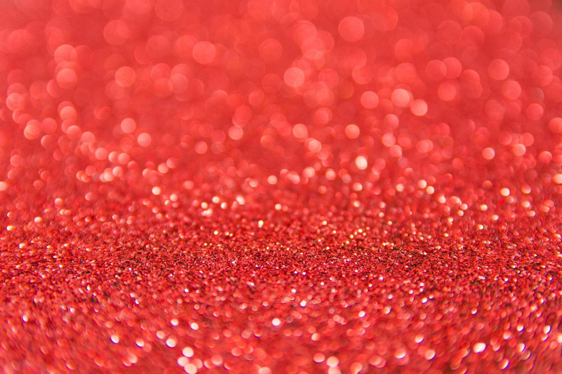
Red
Red is a powerful color. It is an intensive color. It can have a significant impact on your marketing in a variety of different ways.
Alone, the color red immediately grabs people’s attention. It gives consumers the message that they need to act right now. In fact, it creates a sense of urgency when it is a part of a marketing campaign.
The color red has the power to project hunger, which is why it is frequently used in food packaging and in restaurants. It also has the power to project a vibe of bold and powerful masculine energy.
On the other hand, the color red carries some negative implications besides positive ones. It projects anger, danger, and aggression. It is important to use the color red with a lot of tact so you can avoid these implications.
With that said, there are several brands that use the color red in a successful fashion: Coca-Cola, Netflix, McDonalds, and Nintendo. These companies know how to use the color red in a tasteful way.

Orange
Compared to red, the color orange has a variety of different effects when used in marketing. Like the color red, it has the power to grab attention and invoke energy and excitement when we use it in the right way like a “Call to Action (CTA)” button on a website. It is also a color that’s used for sports branding to invoke energy and motivation.
Besides that, the color orange also carries the vibe of comfort and value. It communicates that a product is something affordable yet of reasonable quality. When used correctly in this way, customers become enthusiastic and are inclined to act.
The color orange is often associated with the season of autumn especially during the Halloween season in October. I know that I want to grab everything pumpkin spice when I see this color make its appearance during this time of year.
The color orange is also associated with the feeling of creativity, confidence, courage, and fun. It has a color that is frequently used to target younger consumers as well.

Yellow
The color yellow has a strong positive connotation when used properly. It carries an energy of happiness, youth, optimism, and youth. It also carries the energy of friendliness and sunshine.
The color yellow that grabs customers’ attention when used properly. It is color frequently used in retail and in advertising.
Even though it is color that mostly has positive associations, the color yellow does have its negative side. When it is not used properly, it can carry the energy of fear, irrationality, and anxiety. Like the color red, there are several companies that have used the color yellow successfully in its branding: Cheerios, NesQuick, Chupa Chups, Denny’s, Stanley tools, Caterpillar, McDonald’s, Post-its, and National Geographic. All of these brands applied the use of yellow either in their logo or in other components of its branding.

Green
The color green has its own effect on marketing, and it is versatile. It is often associated with environmental, eco-friendly, and ethical connotations. It also creates a vibe of trust for a brand when it is used as part of a marketing campaign. Brands that use the color green as a part of their logo tend to have less competition compared to other colors.
When the color green is used in marketing, it creates feelings of health and freshness. It is also a color that creates relaxation and a sense of calm. It is a color that creates feelings of compassion and confidence. It is also a color that’s associated with money and prestige.

Blue
The color blue is a common color used in marketing because it has many positive associations tied to it. When brands use the color blue in their marketing, it creates a sense of trust in the brand. It creates a calm and soothing environment when it is used in marketing. It also creates a sense of professionalism, confidence, and loyalty when we use it as a part of branding strategy.
The color blue projects a sense of likeability and predictability. At the same time, different shades of blue appeal to different demographics. Older consumers tend to be drawn by darker shades of blue. In contrast, younger consumers tend to be drawn to lighter shades of blue.
Even with the positive connotations, when the color blue is not used correctly, it can lead to negative associations with it. The color blue can invoke feelings of depression and sadness when overused in branding. It is important to do your research when using the color blue in a global campaign and use the color mindfully.
Brands that have been successful in using the color blue are Ford, American Express, Twitter (X), Facebook, Oral-B, Nivea, Noxzema, LinkedIn, GE, and Chase.

Purple
The color purple has a several different connotations when we use it as a part of a marketing and brand strategy. It is a color that’s not used too often as a part of a strategy.
The color purple carries the feeling of royalty, prestige, and high status. It invokes a sense of wealth in the brand.
The color purple can invoke a range of emotions when we use it like creativity, calm, and mystery. When used, it can also create a deeper connection with the audience. It also invokes femininity and is a natural selection when used to appeal to women and girls.
The color purple creates a feeling of spirituality, balance, and wisdom. This color is a natural selection for therapeutic or religious products or services. In contrast, it is a color that creates the feeling of fun and whimsy when used as a part of a marketing campaign for a playful product.

Pink
The color pink has a several interpretations when used in marketing. It is a natural choice when used to create a feeling of femininity and appealing to women and girls. Certain shades of pink make an excellent choice to use as a part of a welcome email campaign because it creates a positive first impression.
The color pink has a calming effect as a part of a marketing campaign. On the hand, it can also create a sense of energy and stands out when used in the form of hot pink. T-Mobile is one brand that has used this color successfully in its branding and marketing campaigns.

Black
The color black has both positive and negative connotations when used in marketing. On the positive side, it creates an energy of mystery and security when used properly. It is a versatile color and can be paired with any color.
On the other hand, when it is not used properly, it can negatively project feelings of coldness, evil, and mourning. When it is used too much, it can make a brand unapproachable and leads to feelings of depression and negativity.
Brands that have used the color black successfully are Chanel and L’Oréal who both use the color black as a part of their logo.

White
The color white is another versatile color that’s used in marketing and can be used with any other color. When the color white is used, it can create a perception of purity and cleanliness.
The color white can have a decluttering effect when used in the right way. It can help to make small spaces look larger and help people feel more organized. It is a color that also be used to create contrast when used as a part of a retail store environment. It is a color that invokes creativity and is frequently used by tech and startup companies.
With that said, it is important to remember that the color white has a distinct cultural significance when it comes to global marketing. In many eastern cultures, it is a symbol of death and sadness. It is important to do your due diligence before using this color in a global campaign.
Brands that have been successful in the use of the color white are Apple, Tesla, Zara, and Sony. All these brands use the color white as a part of their logos.

Grey
The color grey is a neutral color used in marketing. It evokes a sense of neutrality and balance when used as a part of a marketing or branding campaign. It brings up feelings of sophistication and a sense of modernity, which is frequently used in luxury brands.
The color grey gives a sense of conservatism and practicality when used in marketing. At the same time, it gives customers a feeling of inspiration to be able to create their own vision.
When it is not used properly, the color grey can be very uninspiring and can bring up feelings of nothingness and depression. It is important to use the grey to contrast other colors or as a part of a backdrop.
Choosing the Right Color Scheme for Your Brand
When selecting a color scheme, consider your brand’s personality and the emotions you want to convey. A tech company might opt for sleek blues and grays to suggest innovation and professionalism.
Additionally, it’s essential to research your target audience’s cultural perceptions of colors, as some colors might carry different meanings in different cultures. By doing so, it can help your brand reach a global audience and avoid any culture misinterpretation when seen in the wrong way.
It is important to do your research when you enter a new global audience. By doing so, you avoid a significant PR disaster that could be particularly challenging to overcome.
Tips for Implementing Color Psychology in Your Marketing Strategy
Start by defining your brand’s message and values, then select colors that align with those elements. Create mood boards to visualize how distinct colors work together.
Be sure to test your color choices through A/B testing on your website or advertisements to see which colors resonate best with your audience and drive engagement. Consider using surveys or component testing. The more feedback that you receive the better.
Conclusion
The use of color is an enormously powerful tool when it is used properly. It can also be something that could hurt your brand as well when used improperly. Colors can have profound effects on consumer behavior and purchasing. Each color has its own power and strengths. It is important to know what color will work for your company and its branding.
It is also important to understand how colors affect your global marketing campaigns. It is important to know what colors would not work for certain regions and countries that you will be marketing your products.
In the end, the use of color creates a memorable experience for your customers.

[…] I stated in a recent blog post, the power of storytelling can not only inform but also inspire, fostering…
[…] How AI Transforms Marketing Psychology Today – https://psychedaboutmarketing.com/2025/02/06/how-ai-transforms-marketing-psychology-today/ […]

Leave a comment